
· 10 min read · worthmydegree.com
For parents: how to run your student's numbers in one sitting
Maybe your student has three acceptance letters. Maybe they have a shortlist and no idea which of them you could actually afford. Either way, the cost of attendance on the page tells you almost nothing about what this will cost your family, or whether the degree pays it back.
Which is a strange feature of American higher education. The figure is quoted to the nearest dollar and means almost none of it. You can get a firmer estimate for a bathroom remodel, and the remodel comes with a warranty.
This is the order to work in. It works at either stage, and the earlier you do it the more of the decision is still open.
Why the letters do not compare
A cost of attendance is a sticker price. It is not what you pay, it does not include the loan interest, and it says nothing about what your student earns afterwards. Two schools quoting figures $20,000 apart can land in the same place once aid, borrowing and the job at the end are in the picture, and two quoting the same figure can land nowhere near each other.
Meanwhile the rules changed. For loans first disbursed from July 1, 2026, Parent PLUS is capped at $20,000 a year and $65,000 in total per student across both parents combined. It used to be limited only by cost of attendance, which in practice meant no ceiling at all. If your plan was "we will borrow the gap," the gap may now be larger than the loan available to cover it.
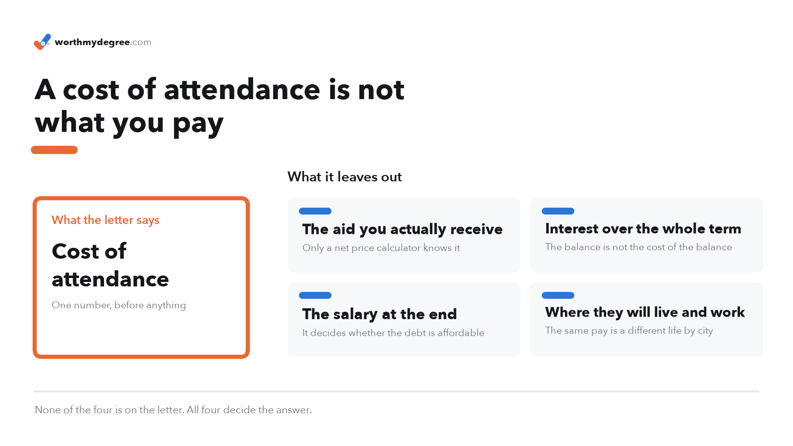
None of those four appear on the letter, and all four decide the answer. That is the gap this walkthrough closes.
Four questions, not one
Before you open anything, know what you are trying to answer:
- What will we actually borrow, not what does the school charge
- What is the monthly payment on that, after tax, in the city where they will work
- How long until the degree is ahead of not going at all
- Whose name is the debt in
That last one is the question families skip, and it is the one with the sharpest consequences. More on it at the end.
The order to work in
Open worthmydegree.com and click through to the calculator. There is no login and nothing to sign up for, and nothing you type is attached to your name.
Work down the sidebar. It is arranged in the order a family actually decides things, and every number on the page updates as you go. There is no calculate button to press.
Start with who is going
Under About you, answer Who is going to school? Leave it on Straight from high school for a graduating senior. If you are the one going back, pick Going back to school, and the whole comparison changes underneath you: instead of measuring against a high school graduate, it measures against your own current salary, which is the honest comparison for an adult with a job.
Then what they will study
Under What you'll study, the Choose by control is the one worth understanding.
Major covers 73 fields and reports what everyone who studied that subject earns, including the graduates who ended up in work that never required the degree. Career covers 836 occupations and reports what people actually doing that job earn, with the full range from the tenth to the ninetieth percentile.
Major is the more cautious basis, because it counts the people for whom it did not work out. Start there.
Name the school, and the city afterwards
Under School & city, type the college into Your college (type to search). There are 5,035 real schools with published costs, so yours is almost certainly in there. Tick I'd pay in-state tuition if that applies, because in-state and out-of-state are different prices for the same seat.
If you do not have a shortlist yet, work the question backwards instead. Under More tools at the bottom of the page, Find schools that fit a budget takes a field of study and a price ceiling and returns every college that teaches it inside your budget, priced for the state you actually live in. That is the step that surfaces the schools a family has never heard of.
Then set where they will live and work after graduating. This is not where they study. It matters because the same salary is a different life in San Francisco than in Columbus, and the tool compares local pay against local costs across 23 metro areas.
Let the loan fill itself in, then correct it
Under Paying for it, the Loan estimate control starts on Simplified, which uses what graduates of that specific school who borrowed actually left with. That is a real outcome rather than an estimate, and it means you get a usable answer without entering anything.
Switch to Detailed when you know your own figures, and enter your Cost of Attendance, Personal Contribution and Grants & Scholarships per year. Whatever lands in Total Loan Amount is what every number on the page uses, and you can type over it directly. If you are holding a real financial aid offer, that number beats every estimate on the screen.
Choose how it gets repaid
How you'll repay decides the monthly payment more than the balance does. For a 2026 start the default is the Repayment Assistance Plan, which is the new income-driven plan: the payment comes from income rather than from the balance, unpaid interest is waived, and whatever is left is written off after 30 years.
One thing to carry with you. Since January 1, 2026, a balance written off at the end of an income-driven plan is taxed as ordinary income in the year it is discharged. A forgiveness figure is a bill deferred, not a bill canceled, and the tool says so rather than quietly counting it as a win.
Read the verdict, not just the payment
At the top of the results is a box headed Is this debt worth it? It answers in a sentence, and it names the loan amount at which the answer flips. That ceiling is the actionable number. If you are above it, the box says by how much.
Below that sit the monthly payment, the payoff timeline, and a chart of where your student stands each year against someone who skipped college and started working at eighteen. The comparison uses real median pay for a high school graduate, currently $51,688 a year.
Put the second school next to the first
Tick Compare Two Scenarios in the sidebar. You get two full scenarios side by side, running the same arithmetic twice with no shortcuts. This is the step that makes the cost land, because a number on its own is abstract and two numbers next to each other are a decision.
Compare the schools. Then compare something less obvious: the same degree started at a community college, or a career that needs no degree at all. There are 430 occupations in the data that are entered with a high school diploma or less, and those are charged no tuition, no loan and no given-up years, while the pay comparison stays exactly as it was.
Replace the averages with your own numbers
Further down the page is a section headed Get Your Real Numbers. It links to two free federal tools, and this is the step that turns a good estimate into your actual situation.
Your school's Net Price Calculator returns your net price, meaning cost after grants and scholarships. Enter that as Cost of Attendance and set Grants & Scholarships to $0, because the net price already subtracted them. The federal Student Aid Estimator returns your Student Aid Index, which you enter as Personal Contribution. The two compose correctly rather than double-counting.
Take it away with you
Use Download PDF Report. You get a sourced one-page report with the charts and the figures, which is the version that survives the drive home and can be read by a student, a spouse, or a counselor who was not in the room.
Share Scenario puts the whole scenario in a link instead, so the person you send it to opens exactly what you were looking at.
What you are holding at the end
Four things you did not have when you sat down:
- A monthly payment in after-tax dollars, in the city where they will work
- The loan amount at which this degree stops paying for itself
- The year the degree pulls ahead of not going, which for a long training path can be well after the ten-year mark most comparisons stop at
- The same three things for the alternative, next to each other
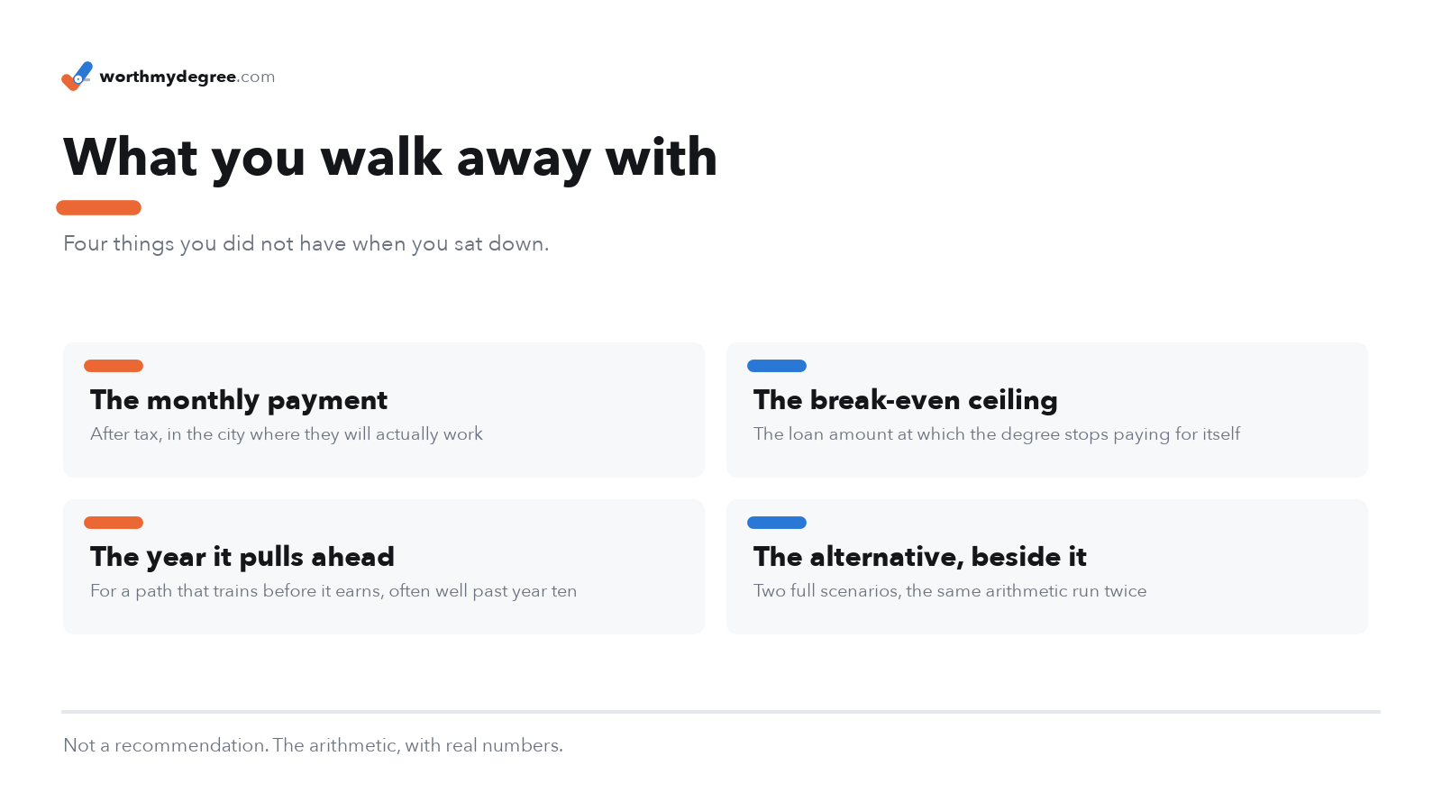
None of it is a recommendation. It is the arithmetic your family was going to do on the back of an envelope anyway, done with the real numbers.
The one number most families miss
Parent PLUS is the parent's loan. Not the student's.
That has consequences that do not show up on any award letter. It is not eligible for the new income-driven plan, so the payment does not flex with your income. It is not forgiven at the end of a term the way your student's own Direct loans can be. And it stays with you into the years you were planning to retire in.
The tool models this separately for exactly that reason. Your student's own federal Direct loans run on the income-driven plan with forgiveness at the end, while the Parent PLUS and private portion is repaid in full on an ordinary fixed schedule alongside it. The payment you see is the sum, and the payoff date is when the later of the two clears.
When you name a school, the tool also shows what families of completers at that school who took Parent PLUS actually borrowed, at the median. Read that as a warning shot rather than a target. It is conditional on having borrowed at all, and those families borrowed under the older rules with no ceiling.
What this will not do for you
Worth knowing before you lean on it.
Every salary assumes your student works in the field they picked. Nationally that holds for about six in ten graduates. The Federal Reserve Bank of New York puts underemployment at 39% overall, ranging from 13% in nursing to 66% in criminal justice. In Major mode those people are counted in the average. In Career mode they are not, because that mode reports what people already doing the job earn.
It does not rank schools by outcome, and it does not claim a pricier school leads to higher pay. The school affects the cost side only. Every salary comes from the occupation or the major, never from the institution.
And it is an educational estimate rather than financial advice. The figures are national medians and published federal data, so they will not match any one family exactly. That is the point of replacing them with your own.
Run it for your own schools
Every figure above comes from public federal data, and the Methodology section at the bottom of the calculator traces each one to its source.
None of it is hard. It is the arithmetic your family was going to attempt at eleven at night, on a phone calculator, with increasingly strong opinions. This version just has the real numbers in it and does not require anyone to remember how compound interest works.
Print the PDF before that conversation rather than after. It is better at settling an argument in the car than either of you is going to be.